
Mental Health Wallet
Mental Health Wallet
First Self-Assessment Experiences Under HIPAA Constraints
Healthcare


Timeframe
Timeframe
Nov 2020- Feb 2021
Nov 2020- Feb 2021
Industry
Industry
Healthcare
Healthcare
Role
Role
UX Designer
UX Designer
Note
Due to the sensitive nature of healthcare data and strict HIPAA compliance requirements, I have omitted certain proprietary screens and personal user data. However, as the lead UX Designer on this initiative, I was fully hands-on throughout the product’s lifecycle from navigating regulatory constraints in research to the final high-fidelity launch. The artifacts shared here provide a transparent view of my process in balancing empathetic design with robust data security to deliver a trusted solution for the US mental wellness market.
Introduction
Mental health challenges are increasingly common, yet access to reliable, trustworthy self-assessment tools remains limited especially in the U.S., where privacy, compliance, and medical liability shape what can and cannot be designed.
Mental Health Wallet was a 3-month initiative to design a self-diagnostic mental wellness app that allows users to screen their mental health safely, privately, and confidently without crossing regulatory or ethical boundaries.
Role: UX Designer
Team: Project Manager, Design Lead, Engineer
Constraints: HIPAA, data sensitivity, ethical self-diagnosis limits
Problem
This was not a typical consumer UX problem.
Users wanted:
Clear answers about their mental health
Reassurance and guidance
A fast, simple experience
The system required:
Strict HIPAA compliance
Careful handling of diagnostic language
Guardrails against false reassurance or panic
The core tension:
How do you provide clarity without over-diagnosing, and reassurance without violating trust?
Research
Research focused on understanding trust, fear, and hesitation, not just usability.
Key Activities
User interviews and surveys around mental wellness tools
Competitive analysis of existing self-assessment and mental health apps
Early alignment with stakeholders on HIPAA requirements
What We Learned
Users were willing to self-assess—but only if they trusted how their data was handled
Overly clinical language increased anxiety
Overly casual language reduced credibility
Insight
The defining insight was simple but non-obvious:
In mental health self-assessment, trust is the primary UX metric not engagement.
Accuracy, clarity, and restraint mattered more than delight.
Every interaction needed to signal:
“Your data is safe”
“This is not a diagnosis”
“Here’s what you can do next”
Ideation
This insight became a filter for every design decision.
Design Principles We Set
Reduce ambiguity, even if it slows users slightly
Avoid gamification or reward loops
Use progressive disclosure for sensitive results
We explored richer dashboards and more expressive feedback states but intentionally pulled back. Anything that felt emotionally manipulative or diagnostically misleading was discarded.
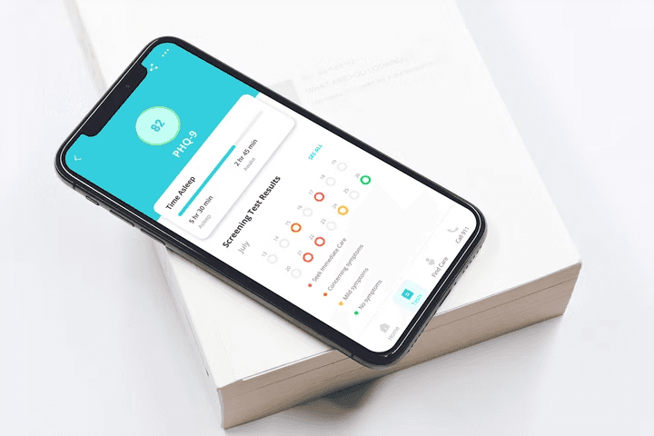
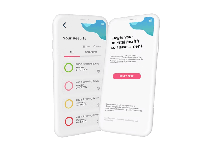
Solution
The final solution focused on clarity, safety, and confidence.
Core Experience Decisions
Centralized dashboard with only essential actions
Secure PIN-based access to reinforce privacy
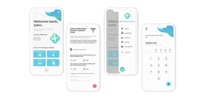
Self-assessment modules that clearly distinguish screening from diagnosis
Results framed as guidance, not conclusions
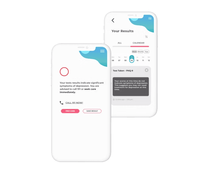
Instead of telling users what they have, the system tells them what to consider next.
Testing & Results
Testing focused on behavioral confidence, not just task success.
What We Tested
Comprehension of results
Perceived trust and safety
Ease of navigating compliance-driven flows
Outcome
95%
HIPAA compliance readiness at launch
20+
iterative improvements by usability and compliance
iterative improvements
30%
increase in user satisfaction ratings post-deployment
increase in user satisfaction ratings
Design
Showcasing the tangible design artifacts that transformed chaos into cohesion.

Challenges and Tradeoffs
Translating dense HIPAA requirements into human-readable experiences
Designing self-assessment flows without encouraging self-diagnosis
Balancing speed with reassurance
These constraints shaped the product more than any visual decision.
Reflections
This project reinforced a core lesson:
In regulated domains, restraint is a design skill.
The most impactful work wasn’t adding features it was deciding where clarity should stop and guidance should begin. Designing within healthcare constraints sharpened my ability to balance user needs, ethics, and system limitations skills directly transferable to other high-stakes product environments.
Note
Due to the proprietary nature of this enterprise security project and NDAs with Johnson Controls, I’m unable to showcase every detail of the work.
Introduction
Mental health challenges are increasingly common, yet access to reliable, trustworthy self-assessment tools remains limited especially in the U.S., where privacy, compliance, and medical liability shape what can and cannot be designed.
Mental Health Wallet was a 3-month initiative to design a self-diagnostic mental wellness app that allows users to screen their mental health safely, privately, and confidently without crossing regulatory or ethical boundaries.
Role: UX Designer
Team: Project Manager, Design Lead, Engineer
Constraints: HIPAA, data sensitivity, ethical self-diagnosis limits
My role extended beyond interfaces; it was to help reshape the system itself.
Problem
This was not a typical consumer UX problem.
Users wanted:
Clear answers about their mental health
Reassurance and guidance
A fast, simple experience
The system required:
Strict HIPAA compliance
Careful handling of diagnostic language
Guardrails against false reassurance or panic
The core tension:
How do you provide clarity without over-diagnosing, and reassurance without violating trust?
The core tension:
Research
Research focused on understanding trust, fear, and hesitation, not just usability.
Key Activities
User interviews and surveys around mental wellness tools
Competitive analysis of existing self-assessment and mental health apps
Early alignment with stakeholders on HIPAA requirements
What We Learned
Users were willing to self-assess—but only if they trusted how their data was handled
Overly clinical language increased anxiety
Overly casual language reduced credibility
Insight
The defining insight was simple but non-obvious:
In mental health self-assessment, trust is the primary UX metric not engagement.
Accuracy, clarity, and restraint mattered more than delight.
Every interaction needed to signal:
“Your data is safe”
“This is not a diagnosis”
“Here’s what you can do next”
Ideation
This insight became a filter for every design decision.
Design Principles We Set
Reduce ambiguity, even if it slows users slightly
Avoid gamification or reward loops
Use progressive disclosure for sensitive results
We explored richer dashboards and more expressive feedback states but intentionally pulled back. Anything that felt emotionally manipulative or diagnostically misleading was discarded.
Solution
The final solution focused on clarity, safety, and confidence.
Core Experience Decisions
Centralized dashboard with only essential actions
Secure PIN-based access to reinforce privacy
Self-assessment modules that clearly distinguish screening from diagnosis
Results framed as guidance, not conclusions
Instead of telling users what they have, the system tells them what to consider next.
Testing & Results
Testing focused on behavioral confidence, not just task success.
What We Tested
Comprehension of results
Perceived trust and safety
Ease of navigating compliance-driven flows
Outcome
95%
HIPAA compliance readiness at launch
20+
iterative improvements by usability and compliance
30%
increase in user satisfaction ratings post-deployment
Design
Showcasing the tangible design artifacts that transformed chaos into cohesion.
Reflections
This project reinforced a core lesson:
In regulated domains, restraint is a design skill.
The most impactful work wasn’t adding features it was deciding where clarity should stop and guidance should begin. Designing within healthcare constraints sharpened my ability to balance user needs, ethics, and system limitations skills directly transferable to other high-stakes product environments.
Challenges and Tradeoffs
Translating dense HIPAA requirements into human-readable experiences
Designing self-assessment flows without encouraging self-diagnosis
Balancing speed with reassurance
These constraints shaped the product more than any visual decision.
Got questions?
I’m always excited to collaborate on innovative and exciting projects!
nayak.pri.work@gmail.com
Phone
6264926162
Got questions?
I’m always excited to collaborate on innovative and exciting projects!
nayak.pri.work@gmail.com
Phone
6264926162